

Rebranding Camana Bay—a landmark destination in the Cayman Islands.
The challenge
Camana Bay recognized they needed a refreshed identity that would reflect the vibrancy of their community, and provide a high degree of flexibility to adapt the brand across a wide array of mediums.

Example of previous materials:

Discovery
On-Island Competitors


Off-Island Inspiration


Visual Themes


Photography audit & guidelines


Stakeholder & Focus Group Feedback

Brand Assessment


The new identity
The new logo conveys confidence, works seamlessly in small and large contexts, and preserves the brand equity from the previously established mark.


Color palette
The palette integrates the local visuals and textures to give a sense of belonging.

Shape system
A dynamic shape system enables flexibility and unexpected possibilities when integrated with patterns and photography.

Bespoke pattern
A one-of-a-kind blossom pattern was created to infuse distinctive personality and versatility into Camana Bay's brand.

Custom illustrations
Spot illustrations of the sea turtle and heron—two animals native to the islands.


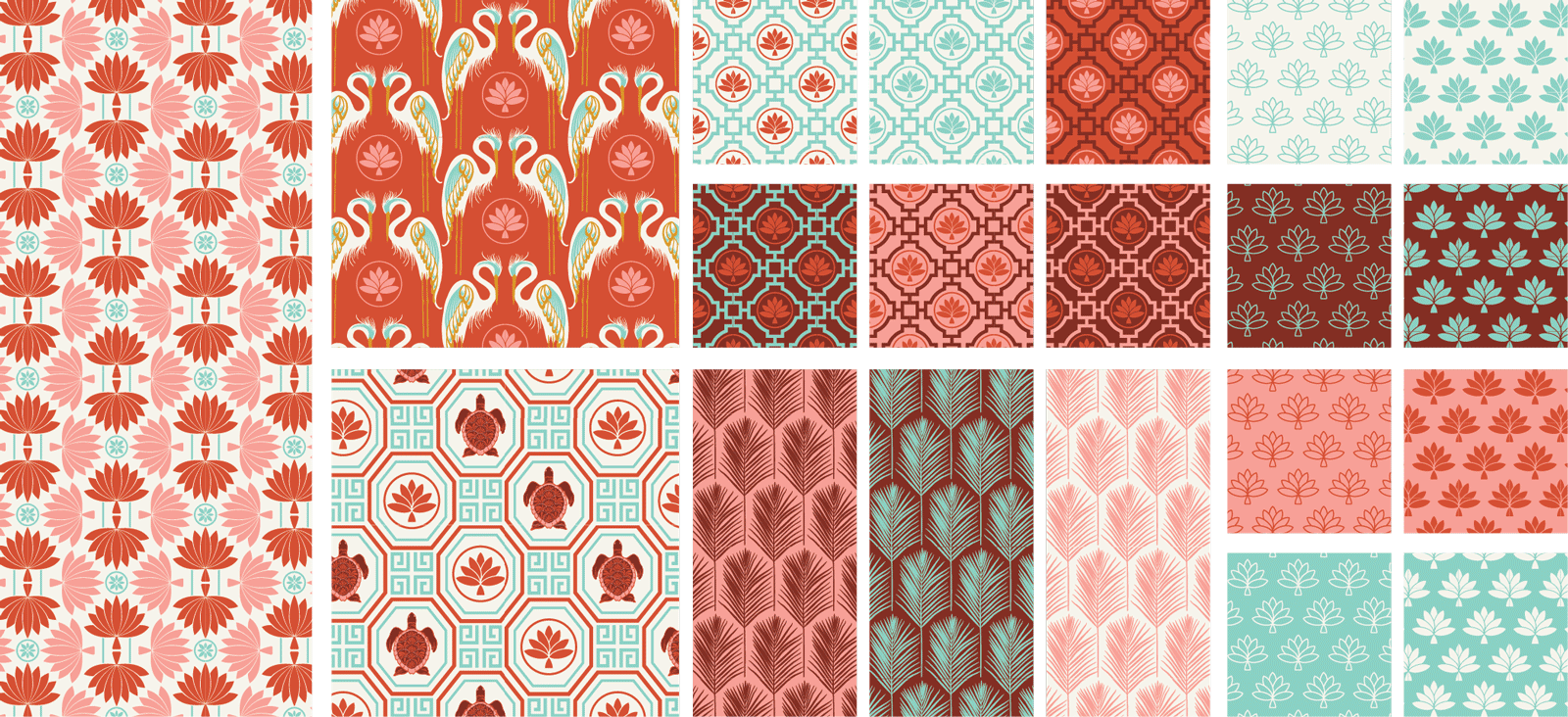
Secondary patterns
A wide variety of secondary patterns and colorways were developed .
Monogram
A custom CB monogram was created to evoke both heritage and rich history.


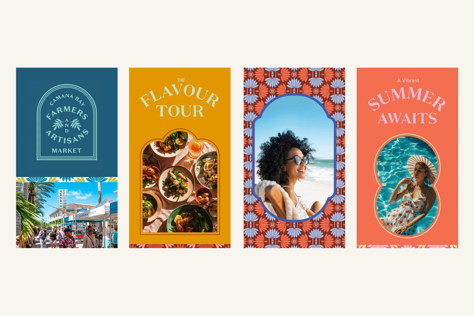
Farmers Market
Suite of print templates, secondary logos, and merchandise for the Farmers Market.


Signage
Signage for seasonal campaigns, wayfinding, and hoardings for advertising.


A wide variety of print pieces were created for marketing and outreach.


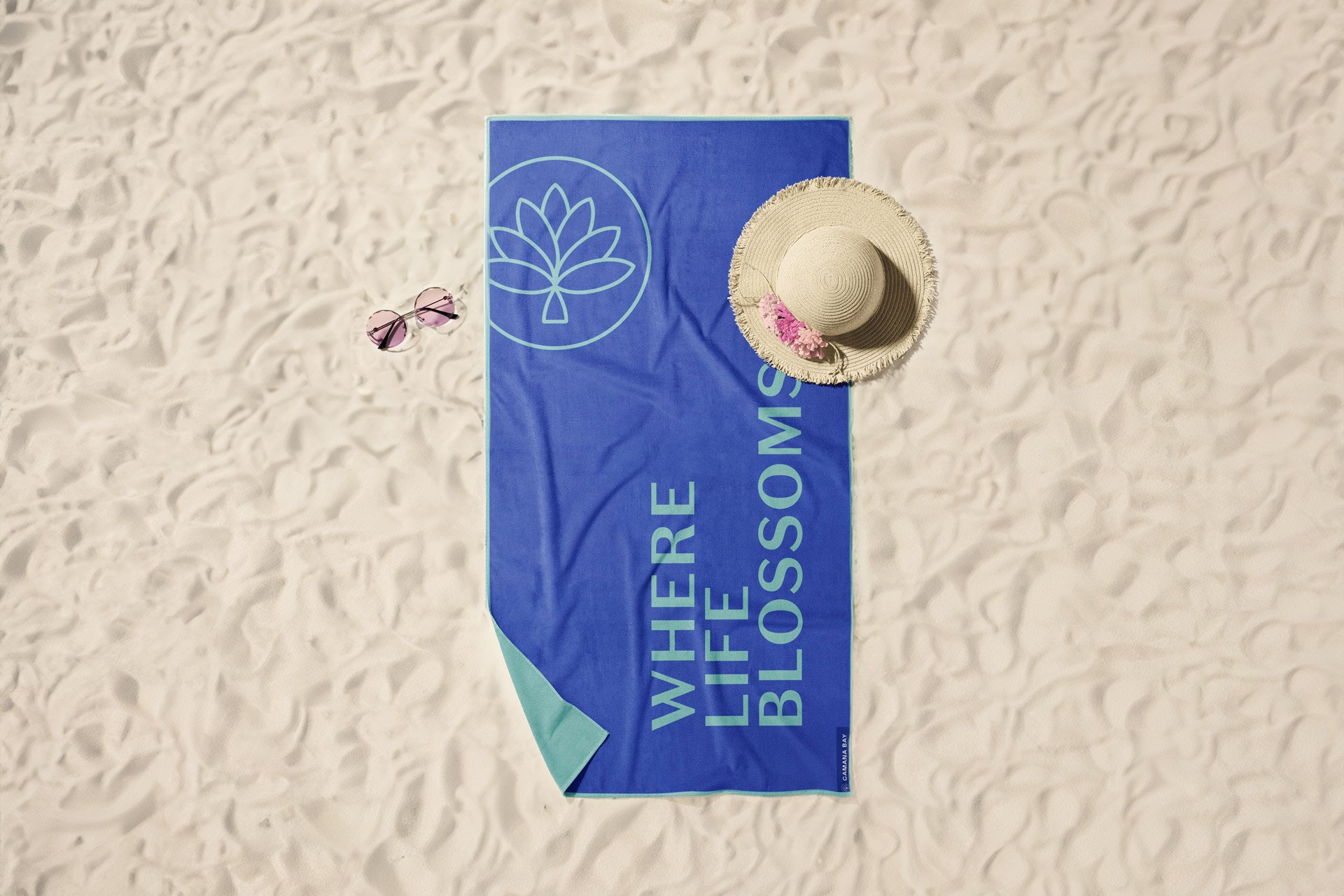
Retail
Ice cream carts, apparel, gift cards, beach accessories, and more.


Digital
Email campaigns, post and stories templates, digital ads and website strategy.


Editorial
In addition to the brand campaign, we helped with an extensive redesign of the Camana Bay Times.


Camana Bus
We worked with the internal design team to develop a shuttle with personality and charm.
